Fascinating facts about what the logos of your favourite car brands mean.
 Ever wondered whether the logo of your favourite car brands represent anything beyond looking pretty? Some car companies have pretty interesting — and weird! — back stories behind their logo designs.
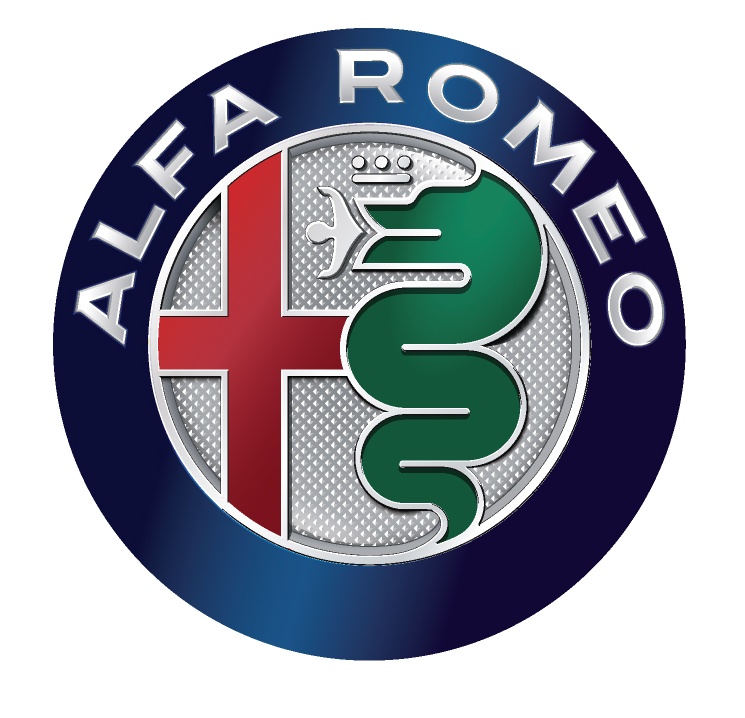
ALFA ROMEO
Not many are aware that Alfa Romeo’s logo has a serpent devouring a man! Look closely and you will spot the figure of a man coloured red in the serpent’s mouth. The symbol was inspired by the coat of arms of the influential Visconti family from 11th-century Italy. The coat of arms sports a Biscione, a type of serpent, devouring an enemy of the time. This emblem, which supposedly shows the power and strength of the Visconti family during those times, is also the symbol of Milan. The interpretation of the image is still being debated, but there’s no denying the Alfa Romeo logo is pretty memorable.
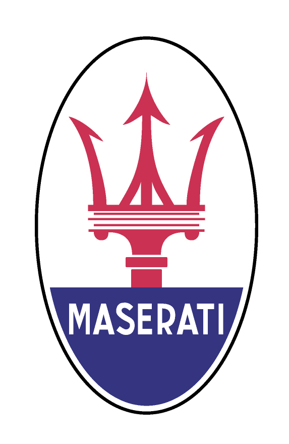
MASERATI
Another Italian marque that is well known and desired around the world is Maserati, which sports one of the classiest car logos around. The symbol is immediately recognisable as a trident. This logo was designed by one of the Maserati brothers; his inspiration was the trident in the famous Fountain of Neptune in Bologna’s Piazza Maggiore. The city of Bologna is the family’s hometown and also the location of the very first Maserati plant. Interestingly, Neptune rules the seven seas, corresponding to — wait for it — the seven brothers in the Maserati family! It may be a mere coincidence, but the fact is nonetheless intriguing.
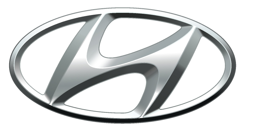
HYUNDAI
Hyundai’s logo design may not be as striking as Alfa Romeo’s but it has a clever idea behind that ‘H’. Most people think the ‘H’ just means Hyundai, which is understandable. But the ‘H’ is actually made up of two individuals — a company representative and a satisfied customer — shaking hands. The handshake is a show of trust and satisfaction between Hyundai, the company, and the customer. The logo is beginning to look dated but you have to admire the idea behind it.
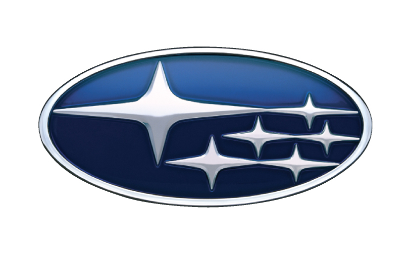
SUBARU
Subaru has a constellation-inspired logo. Subaru alludes to a cluster of stars in the Taurus constellation, known to astronomy enthusiasts as the Pleiades, or The Seven Sisters. But how is it there are only five stars in Subaru’s logo? The Pleiades is known for being the ‘unification of stars’ — two of the stars, to the naked eye, are so close together that they look like one big star. ‘Subaru’, incidentally, also means ‘united’ or ‘govern together’ in Japanese. That large star symbolises Fuji Heavy Industries (FHI), and the five smaller stars represent the five companies that were merged to form FHI (now known as Subaru Corporation). The emblem’s background is nearly always blue to reflect the colour of the actual Pleiades stars.
TESLA
As one of the most innovative motoring companies of the last decade, Tesla has injected much verve to the electric vehicle industry. Its logo, on the other hand, was looked upon as simply a stylised ‘T’ — nothing innovative about that. There have been discussions aplenty about the meaning behind the ‘T’; unfortunately,some have compared it to a female contraceptive! Theorists have said it was meant to resemble the cross-section of an electric engine invented by Nikola Tesla, the person after whom the company is named. This was eventually confirmed by Elon Musk himself in a tweet, something he should have done much, much earlier to avoid wild speculations!
Car logos are not just a straightforward representation of a car brand or company. Next time, do take a closer look at the logo of your favourite car brand; there could be more to it than meets the eye, maybe some hidden meaning or even a colourful history behind its existence!